
Overview:
Gunam is a mobile-responsive, interactive platform designed to help alleviate the stigma surrounding mental health by offering a space for users to vent their frustrations anonymously judgement and find comfort in knowing others share similar struggles.
Team:
Me (lead designer)
Samaria (designer)
Praveen (founder)
Anish (co-founder)
Role:
UX Research
Design system
Usability testing
Duration:
4 weeks
Problem statement
How might we create a safe space for people to share their struggles and seek support?
The goal of this project was to provide a safe space where individuals can openly express their struggles without judgement, find comfort in knowing they’re not alone, and access resources to support their mental health. It aims to reduce the stigma around mental health by fostering an environment where people feel seen and understood. Additionally, it serves as a bridge to professional support by offering access to mental health resources.
01 Stakeholder meeting
Defining project goals
Our client envisioned a digital space where people could anonymously share their thoughts—like writing on sticky notes and posting them on a wall. Many people keep their struggles bottled up out of fear of judgment or self-doubt, and this platform would give them a safe space to express their feelings without that fear. Those reading could find comfort in knowing they weren’t alone. Our client wanted to bring this experience online to promote mental health awareness, and we translated their vision into project goals.
Referencing real world examples


Project goals


02 Research
User insights
Our research uncovered key insights on building trust and safety to encourage user engagement:
Users want to share their struggles but fear being judged.
They are more likely to engage if their identity remains anonymous.
If they share their emotions, they want to be safe from harassment.
Before signing up for any services, they expect full transparency.

Persona

03 Design
Ideations and iterations of our main features
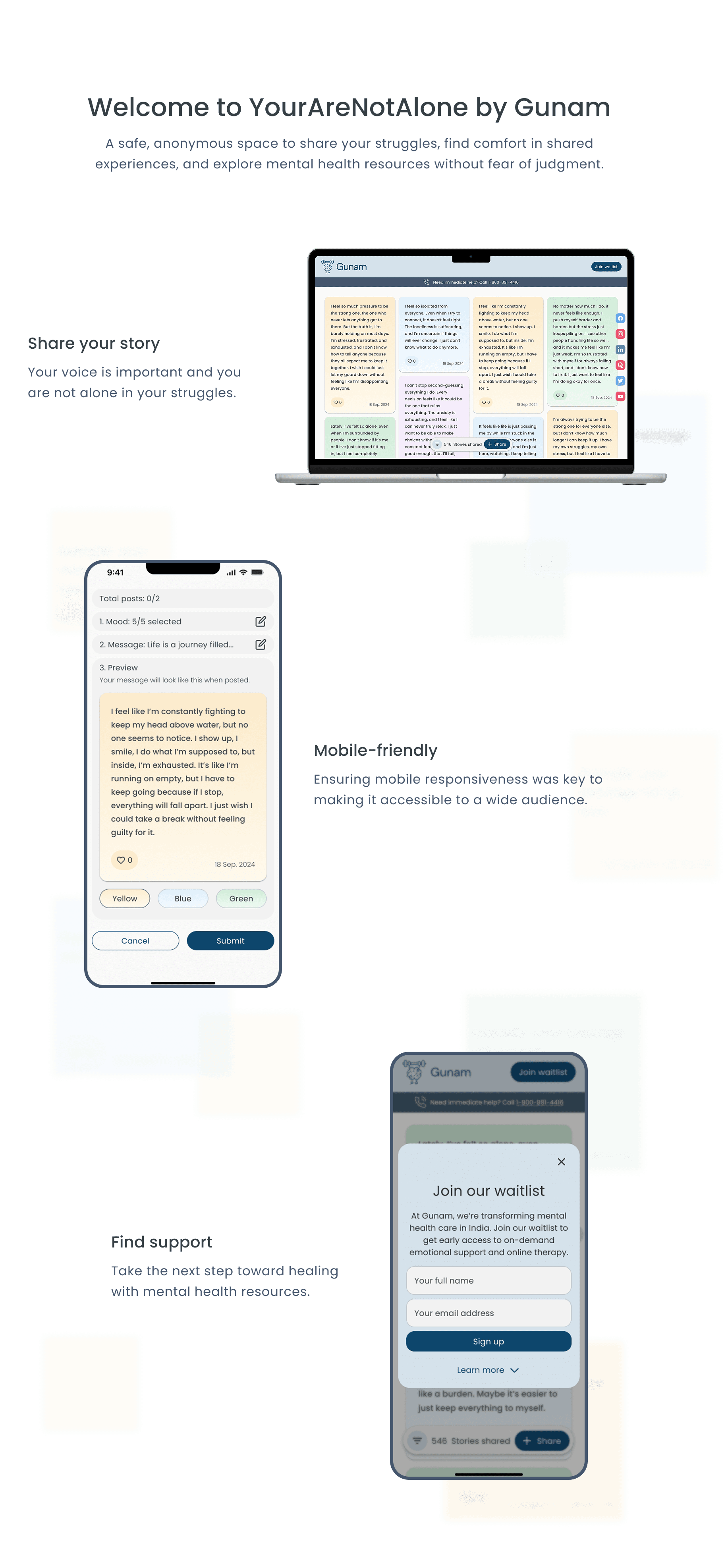
We focused on three key features: the homepage experience, the message creation flow, and the language and information architecture of the sign-up form. Low-fidelity wireframes helped visualize these elements and ensure cohesion. After usability testing and refining our designs, we transitioned to high-fidelity wireframes for further testing and iteration.

Feature 1: Landing page ideas
We had 3 different ideas for our homepage and to come to a decision, we collected data from users, weighed how well they satisfied our user goals, and brainstormed next steps for each issue.
1
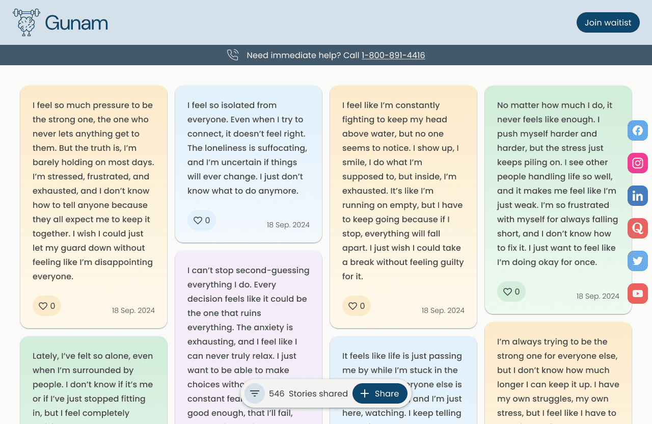
The Wall
Sketched and then created low-fidelity wireframes of the homepage based upon references of real world examples with varying randomness and density moving from one end of the spectrum with consideration for accessibility and readability to the other side of the spectrum leaning more towards natural settings.
Accessible
Natural


Usability test results
Although our test results were successful, the authenticity and density of messages could still be improved.
Users understand the platform’s purpose.
Users comfortably navigate the homepage.
Users know how to to share a message.
2
The Canvas
We also explored other ideas with our client that moved away from real world examples but had potential to be engaging with our users. The Canvas approach was an attempt to provide users an experience where they can travel and explore other people’s messages; a departure from the standard vertical scroll.

Usability test results
Users expressed enjoy interacting with the canvas, however began to felt overwhelmed once they have moved away from the center, feeling overwhelmed and lost among the messages.
Users understand the platform’s purpose.
Users comfortably navigate the homepage.
Users know how to to share a message.
3
The Map
Explored an idea that attempts to address users' needs to feel connected with others by using a map to convey authenticity and as if there are really people around you.

Usability test results
Most of our users preferred this idea since the map helped provide a sense of realism and the ability to see that there are actually other people around them sharing their feelings too.
Users understand the platform’s purpose.
Users comfortably navigate the homepage.
Users know how to to share a message.

Adding positivity
With consideration for vicarious trauma due to all the shared burden in the messages as well as user feedback, we considered adding pockets of positive messages when hovering over each illustration.
However, due to technical constraints, we had to remove the illustrations. Despite that, we still continue to improve the user experience where possible.
Added gradients and floating nav
Made adjustments according to stakeholder's interests to have a floating nav bar with responsiveness in mind. Added gradient colors to soften the tone to evoke a gentle emotion.
Feature 2: Sharing a message

Problem: Too many actions on one page
There were 3 core features that was required when creating a note: choosing an emotion tag, color and text input. Based upon our client’s research, they discovered core emotions that were important for people to express and felt that it was important for users to identify with them. Additionally, we felt adding the ability to choose different colors allows for mixed expression and helps make message posts feel more natural.
Solution: Guiding users step-by-step
We broke each section into steps to help users feel less overwhelmed and create opportunity to add clarity into each instruction.

Feature 3: Sign up form

Early design: Low-fidelity sign up form
Taking the information from our client, we put together a low-fidelity waitlist sign up form. Although we recognized that there could be additional clarity in the language used, we decided it would be best to conduct a user test to identify precisely which parts are misunderstood.
Being concise for clarity and simplicity
Simplified the amount of information at the start to focus on the main points and then added a button to allow users to read more information.

04 Results
05 Reflection
Challenges
Understanding the right audience.
Looking back, I realized I should have been more intentional about aligning user research with the right audience. Most of the users I interviewed were based in the U.S., but my client’s platform was meant for people in India. Because of that, I may have missed important cultural perspectives that could have shaped the design. In the future, I’ll make sure to seek out participants who better represent the intended users to gather more meaningful insights.
Using visuals to clarify ideas and problems.
Working with a client helped me grow as a communicator and better understand their vision. At first, I relied on verbal discussions, thinking we were on the same page, but I quickly realized that some ideas were misunderstood and dismissed too soon. To adjust for this, I started sketching out ideas during meetings so we could all see and refine them together. It made a huge difference—decisions moved faster, collaboration felt smoother, and it’s now a habit I bring into every project.

Examples of visualizing layouts with client.


