Collaborative Redesign Where Client Vision Meets User Needs
Salon Serenity


Timeline
4 weeks
Platform
Web
Industry
Beauty & Wellness
Team
Sole Designer
Overview
A beachside hair salon needing a website refresh to reflect their store identity. I partnered with the owner to redesign a website that aligns her vision with user expectations.

Despite working within a constrained website builder, I led the entire redesign and development process, prioritizing mobile-first usability and clear user flows.
Avg Monthly Calls
2
15
Online Booking
3
in 2024
5
in a month
IMG
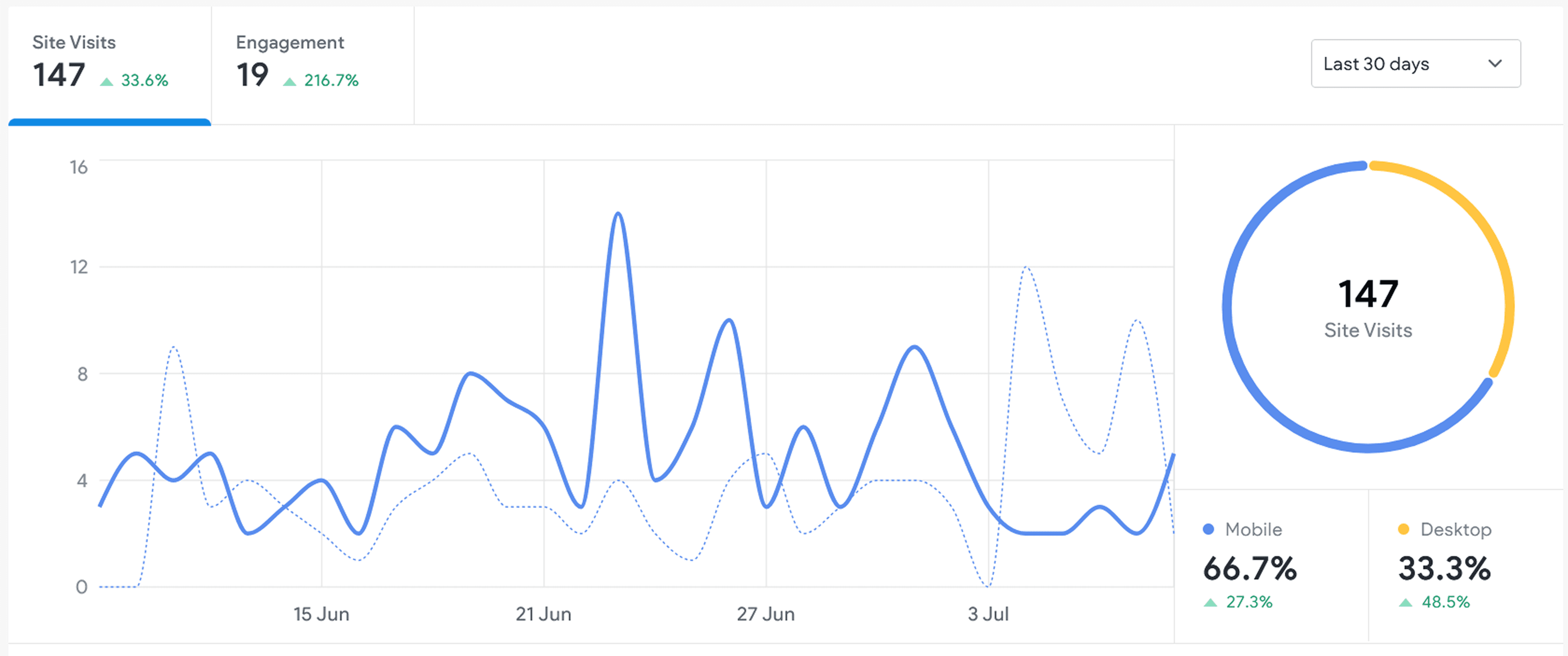
Resulted in improvements to the number of site visits and user engagement within the first month.
PROBLEM
How can we build trust that resonates with users and reflects the salon's true personality?
Their original website was over 10+ years old, with an outdated theme, poor navigation, and missing key information. It no longer aligned with the their beach-like atmosphere.

VIDEO
Original homepage of Salon Serenity's website
CLIENT'S VISION
Challenging the Aesthetic, Defending the Experience
While the client initially preferred a luxury black-and-white look, user research would later revealed that this direction felt inconsistent with the salon’s real-world brand.

IMG
Initial mood board references based on client's preferences, which didn't fit their brand.
INSIGHTS
What Users Really Needed Was Trust, Not Luxury
User interviews revealed a clear pattern: people didn’t trust overly polished, luxury styled salons. They wanted real photos, upfront pricing, and a site that felt honest.

IMG
Affinity mapping: trust signals included transparent pricing, stylist experience, and real imagery.
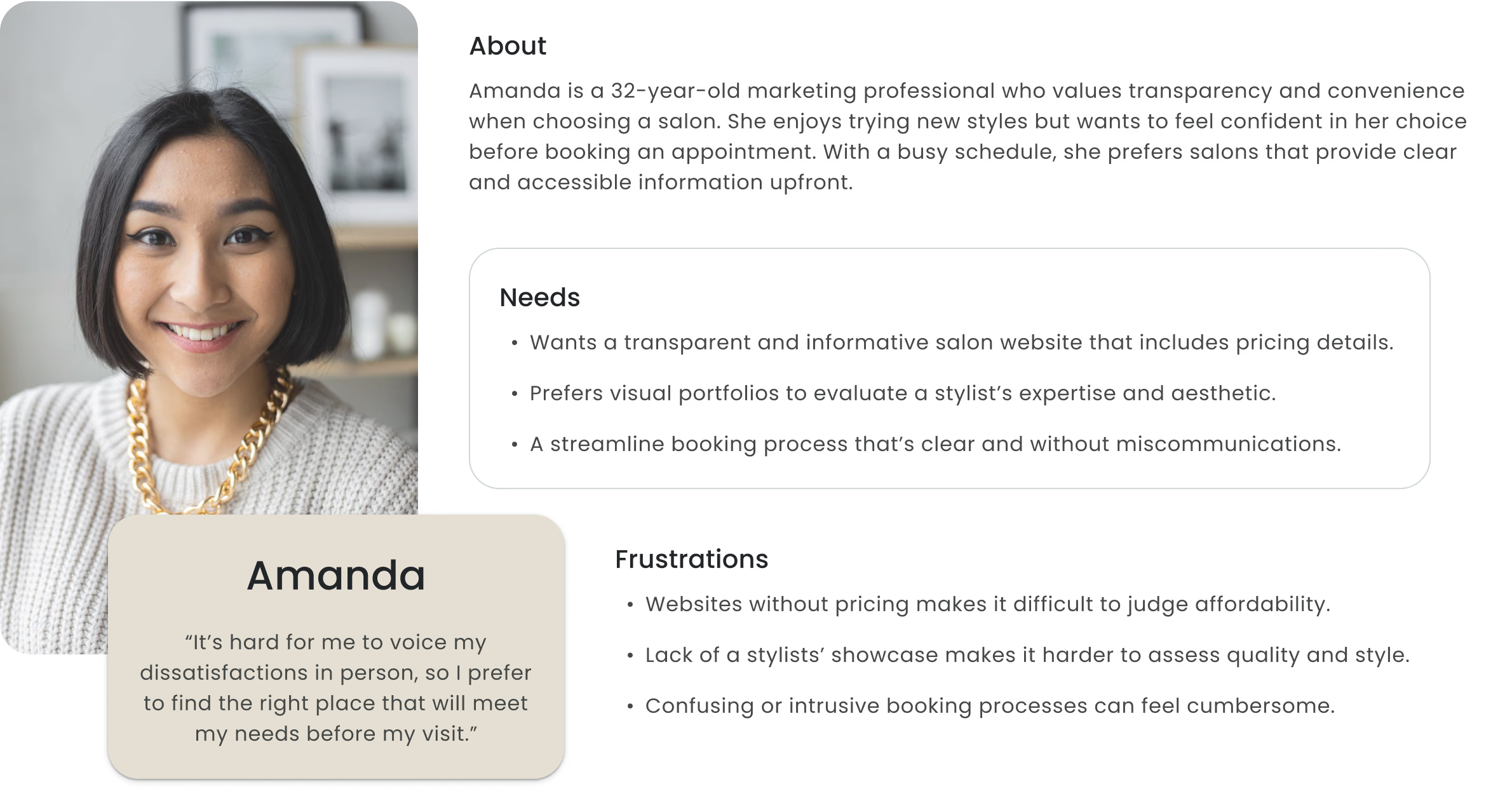
IMG
Persona: focused on user behaviors on decision-making confidence and clear expectations.
SOLUTION
Translating Insight into Layout
I designed a layout that combined the client’s preference for clean minimalism with a visual tone rooted in the salon’s real personality and user needs.
IMG
A minimalist hero layout using playful, beach-inspired photocards to spotlight the actual salon.
Building Credibility Through Stylist Profiles
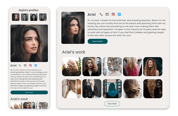
To foster trust and human connection, I proposed stylist profile pages and showcasing real client work. These features made the salon feel more personal and transparent. While not all were implemented due to platform limitations, the intent remained central to the user.
IMG
Proposed stylist profiles to highlight individual expertise and support user decision-making.
A Style Tile That Reflects the Real Salon
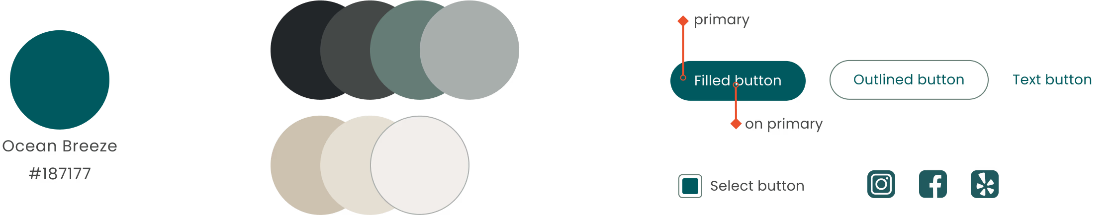
I used a beach-inspired color palette and friendly typography to create a calming feel. The homepage prioritized services, pricing, and booking in a simple, mobile-friendly layout.

Family
•
Warm
•
Friendly
•
Welcoming
•
Casual
IMG
Storefront images and social media content to inspire brand identity for visual direction.
EXECUTION
Making It Work with the Tools I Had
After design approval, the project stalled. The client didn’t want to hire a developer or pay for hosting. I followed up months later and offered to build the site myself using MultiscreenSite, the free platform she was already on.
IMG
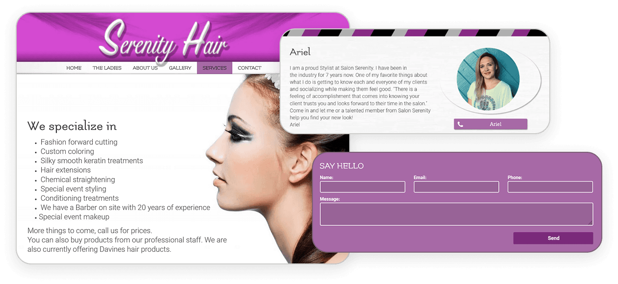
The original site: outdated, cluttered, and not optimized for mobile or modern user needs.
CHALLENGE
Adapting to a Restrictive Platform
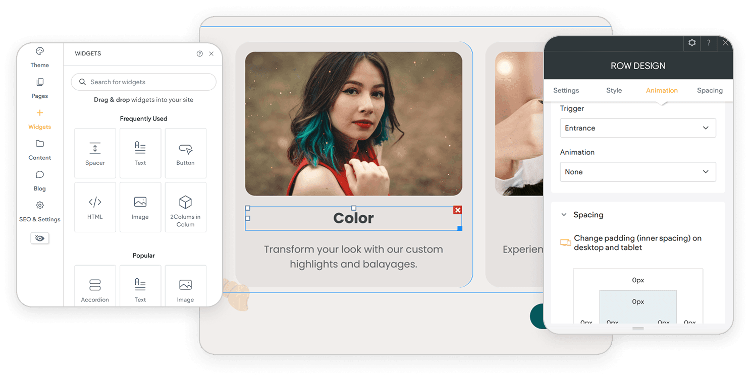
MultiscreenSite had significant limitations, including fixed templates, restricted layout controls, and outdated styling. I spent a day testing the tool’s capabilities and prototyping workarounds to preserve the design’s intent within its constraints.
IMG
MultiscreenSite’s rigid structure required creative problem-solving to stay on-brand.
BUILD
Simplifying Without Compromising the Experience
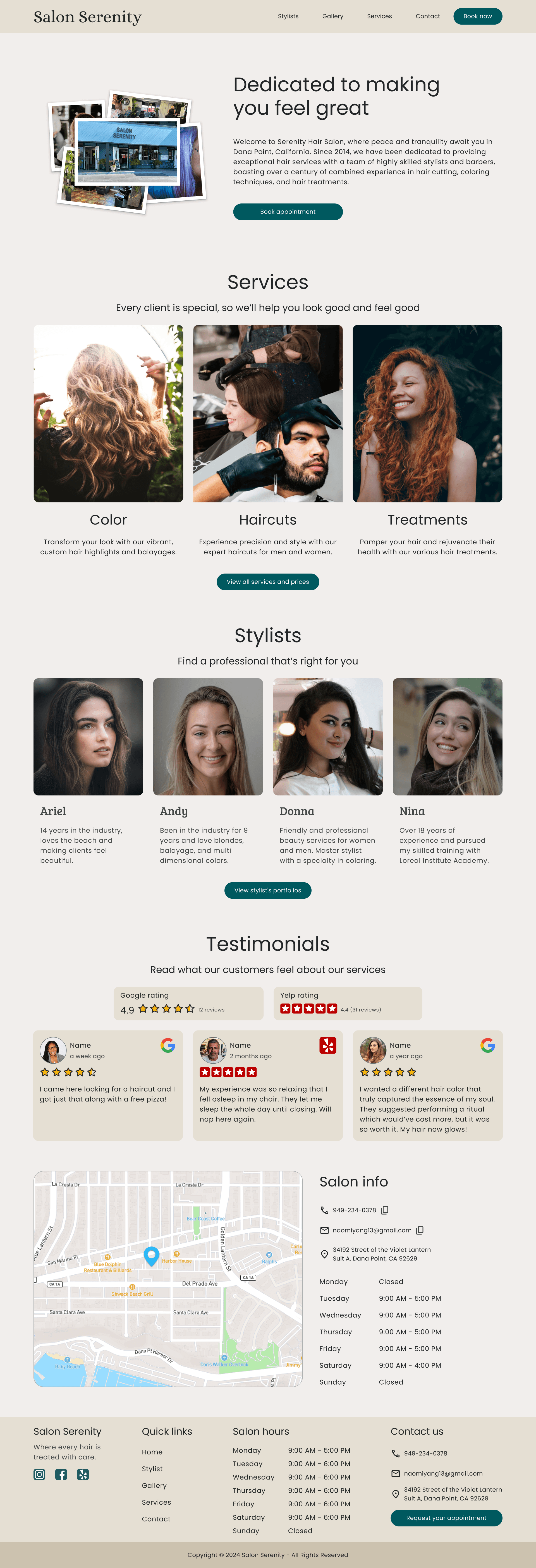
I translated the approved design into a live, mobile-friendly site in just three days. While some features like stylist profiles had to be removed, I focused on typography, spacing, and clear user flow to ensure the site still reflected the brand and served the user.
IMG
Live site: Focused on clarity, booking flow, and mobile optimization, all within a no-code platform.
REFLECTION
Shipping with Constraints, Learning with Intent
The redesigned site successfully launched on the existing platform as a simple, mobile-friendly, and a far better reflection of Salon Serenity’s brand and values. Even with limited tools, the site showed immediate improvements in visitor traffic and engagement, especially from mobile users.
The project reinforced the value of advocating for users, even when it means challenging client assumptions, and taught me how to stay flexible when ideal tools aren't available. I also learned the importance of taking initiative by following up with the client and offering a path forward, I was able to move the project from idea to launch.
This case reminded me that great UX isn't just about tools or trends, it’s about making thoughtful, user-aligned decisions that lead to meaningful results.