Solving the Wrong Problem: How Journey Mapping Shifted Our Design Approach
Moara
Timeline
2 weeks
Platform
Web
Industry
EdTech
Team
1 Designer, 1 Co-Founder
OVERVIEW
Why a Homepage Tweak Wasn’t Enough
Moara brought me in to improve their homepage and increase adoption of a core feature. They thought it was a UI issue, but it was missing a meaningful user journey.
What began as a simple UI request turned into a deeper investigation of user flow. In just two weeks, I delivered short-term solutions and a long-term user flow redesign that helped the team reframe their product strategy and user experience.
PROBLEM
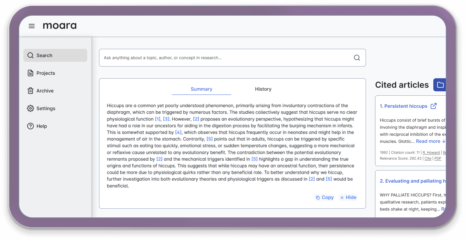
The Homepage Presented Options, Not a Path
It started with a simple ask to improve the UI on the homepage to drive more users towards their main feature, but I needed to understand the purpose and motivations.
IMG
Initial audit highlighting friction points in the homepage layout.
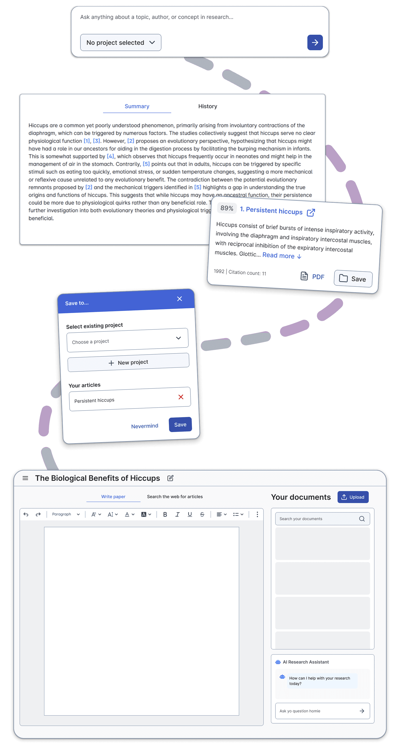
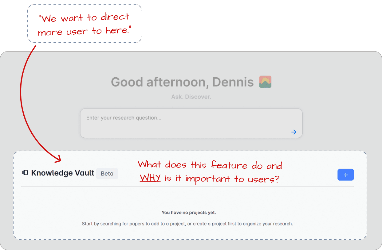
Users Couldn’t See the Value or the Flow
Researchers didn’t understand the purpose of the feature or how it fit into their workflow. The original design lacked context, making it hard for users to see its value.

IMG
User interviews revealed confusion about how features fit together.
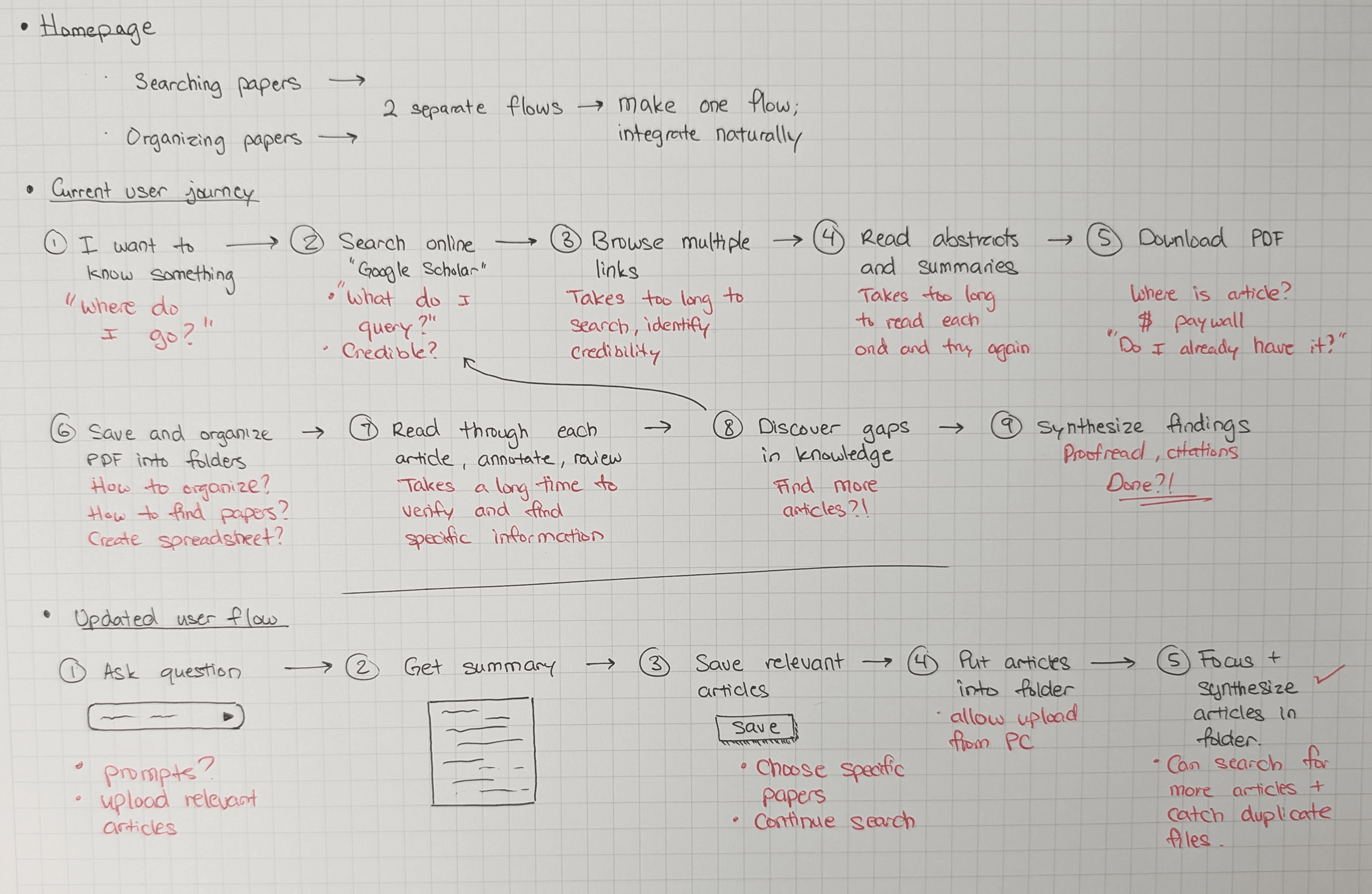
Zooming Out: The Real Issue Was the Journey, Not the UI
After several unsatisfying UI iterations, I stepped back and mapped the user journey, revealing the core issue: Moara’s features existed, but the experience lacked guidance.
IMG
Sketches of the current and revised user journey flow.
SOLUTION
1
Short-Term: UI Tweaks to Clarify the Path
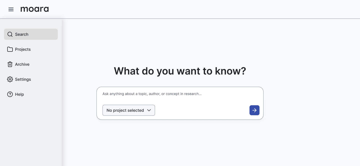
To address the original request from their team, I proposed simple UI changes to clarifying copy and layout to help users understand what “projects” meant and why they mattered.


IMG
Quick UI improvements to support immediate clarity and adoption.
2
Long-Term: A Redesign Built Around the User Journey
I proposed a redesigned journey that helped users reach their goal faster: writing papers. It clarified Moara’s value and created a more satisfying, goal-driven user experience.
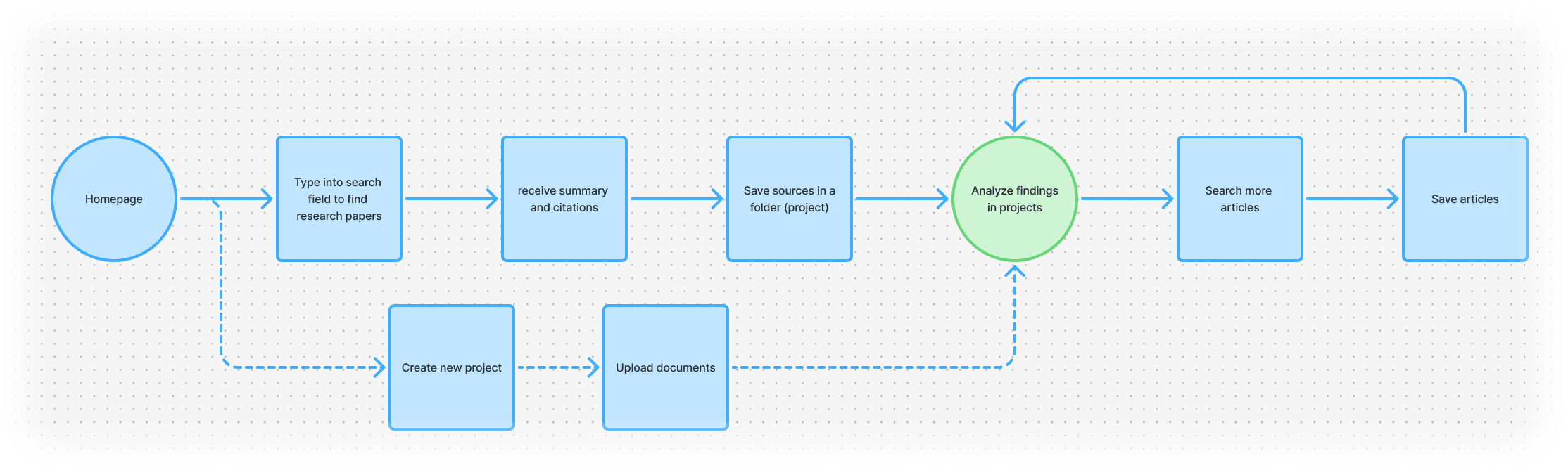
IMG
Restructured user flow
VIDEO
A redesigned experience guiding users toward their ultimate goal: writing literature reviews.
This idea would actually solve a lot of our problems.
— Seth, Co-Founder
REFLECTION
Strategy Over Surface: Designing Beyond the Brief
This project reminded me that good design often means solving a different problem than the one you were asked to fix. While the request was a homepage tweak, the real challenge was a fragmented user journey. By stepping back, mapping the experience, and rethinking the flow, I helped the team see how their product stands out from competitors.
Even though the exact solution wasn’t implemented, the proposal sparked strategic conversations on Moara's product identity and user objectives.
BEFORE

AFTER
IMG
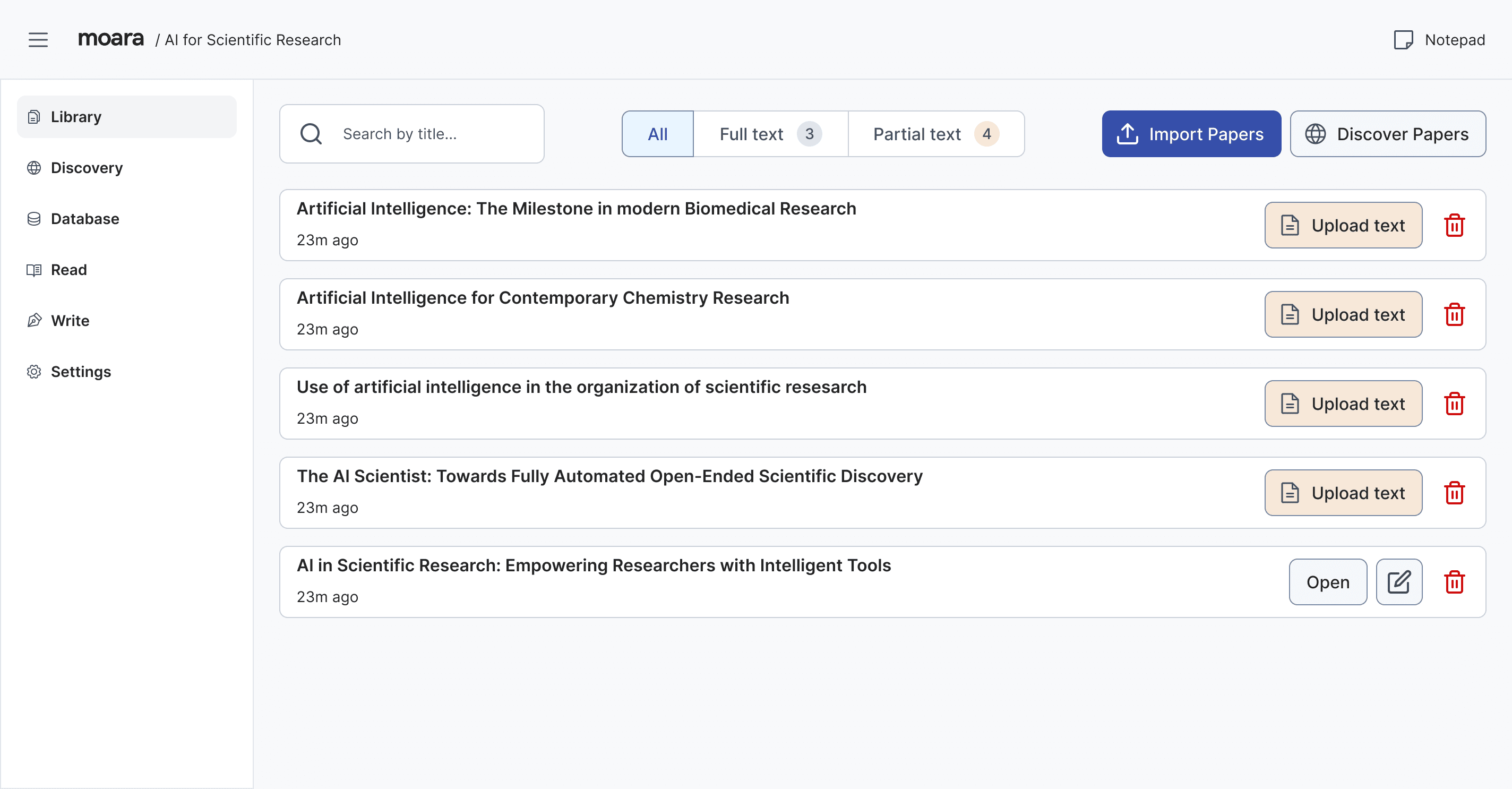
Launched in Moara v2.0, user flow changes were implemented, increasing user satisfaction.


