Breaking the silence around mental health
#YouAreNotAlone

Timeline
1 month
Platform
Web
Industry
Healthcare
Team
2 Designers
OVERVIEW
This temporary interactive platform was designed to help alleviate the stigma surrounding mental health by offering a safe space for users to share their frustrations.
From kickoff to launch, I led the design over 4 weeks, collaborating with another designer and our client, reaching 40,000 user posts within 3 months.

PROBLEM
Stigma surrounding mental health prevents people from finding help.
How might we create a safe space for people to share their struggles to help spread mental health awareness and seek support?
Table of Contents
With just 4 weeks to complete the project, it was important to set clear goals and gather feedback early to stay on track. Since a developer would be joining midway, we aimed to finalize a general layout by week 2 to allow time for technical input.
Week 1 - Vision, scope and user research
Week 2 - Wireframes, testing, and feedback
Week 3 - Transitioning to high-fidelity
Week 4 - File clean up and final design
Week 1: Vision, scope and user research
The Client
So here’s what I’m thinking...
Stigma on mental health makes it harder for people to speak up, seek help, and feel seen.
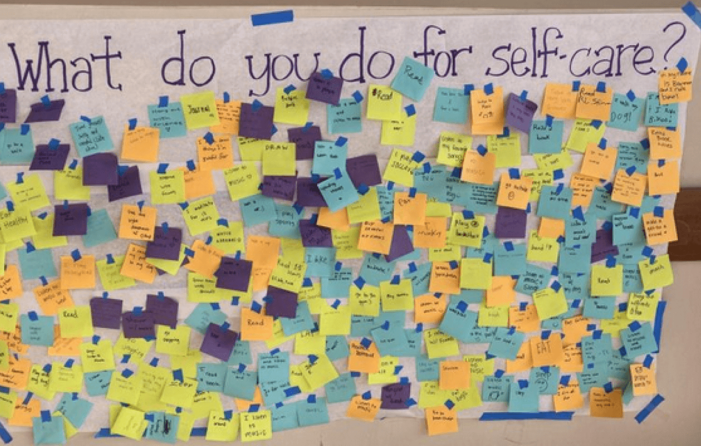
I want a digital version of a post-it messaging wall where people can share their feelings.
Example:
Goal: To spread mental health awareness
Dennis

That’s a great start.
Let’s talk about some other factors to get a better scope of this project holistically.

More details were exchanged, but this laid the foundation for our research as we explored user goals and addressing the problem.
RESEARCH
People wanted to share their feelings, but felt afraid.
We spoke to 6 individuals to understand how they felt about sharing their struggles and identified values they wanted to gain from being vulnerable, revealing 3 main needs.
Judgement free safe space helps users feel comfortable enough to be vulnerable.
reassuring language and ensuring anonymity
Sense of connection allows users to feel like they’re not alone in their suffering.
seeing other people sharing similar stories
Advice and encouragement to help users feel supported in taking actions for help.
emotionally validating feedback and professional support
Focused on 2 key features
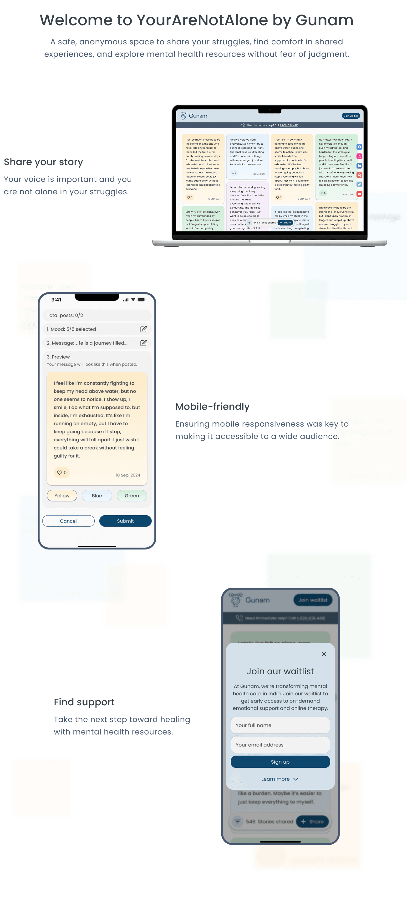
Based on user interviews, people needed to feel safe and reassured before opening up about their struggles. That’s why we prioritized the homepage to create a welcoming first impression and the message creation flow to ensure sharing felt easy.

Improved collaboration through visual communication
When discrepancies surfaced during our meetings with our client, I realized our views weren't always aligned. So, I sketched during discussions to help clarify ideas and improved how we collaborated and made decisions. For example:
We explored how messages would show up on the screen, comparing the pros and cons with layouts and accessibility.
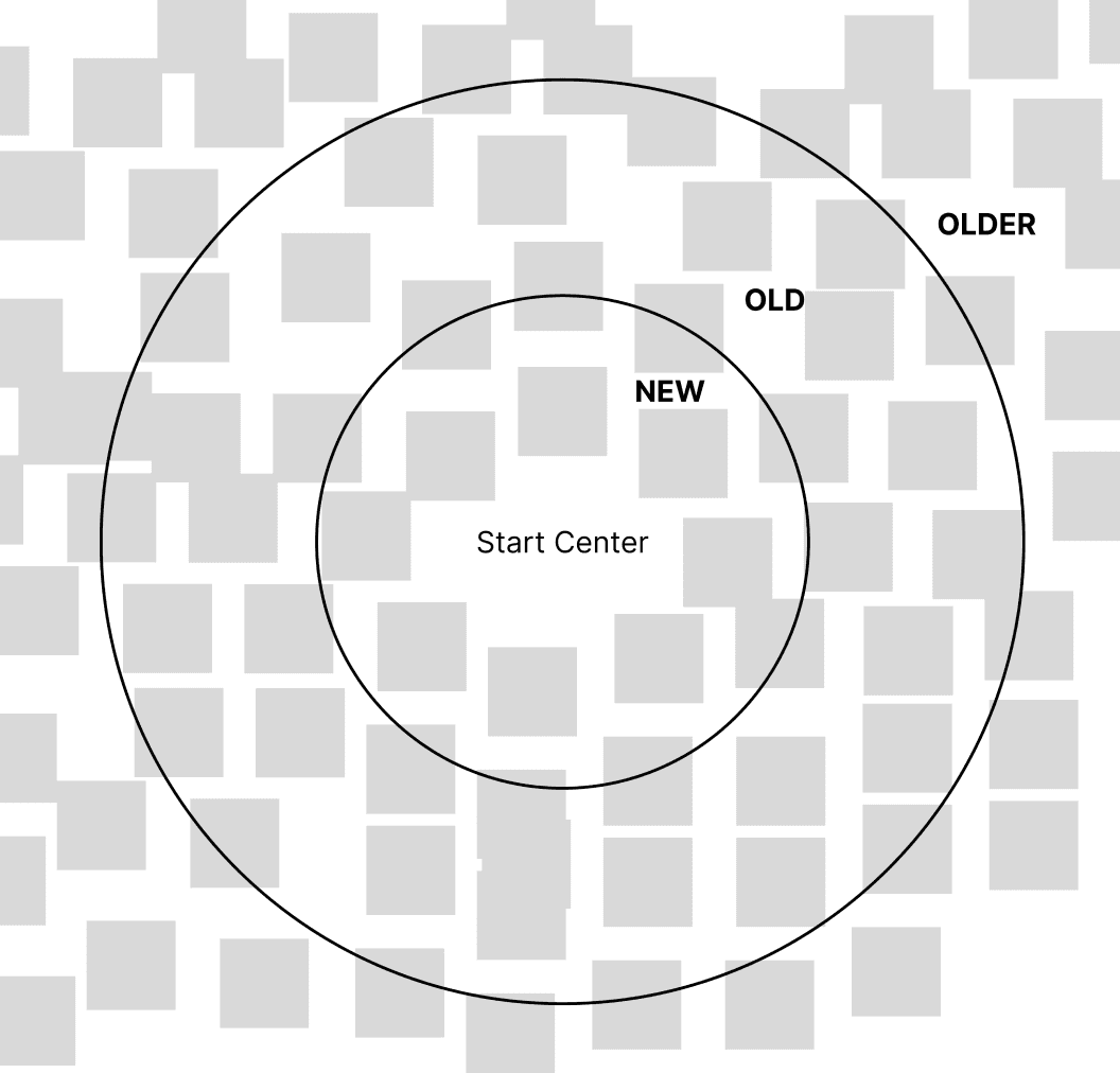
In this sample, we discussed how messages would populate the screen based on metrics like entry date or notes with less engagement.
Week 2: Wireframes, testing, and feedback
DESIGN & PROTOTYPING
Message creation flow
With a developer joining in week 2, I wanted to prepare concepts early to get technical feedback, ensure feasibility and align with development constraints.


Ideating via sketches
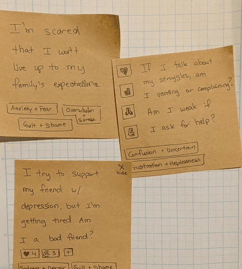
Referencing post-it notes, I sketched and created visuals to ideate different layouts with varying information.
Also tried explored different fonts that imitate scribbles to convey authentic messages written by people.
Anger & Irritability
Sadness & Despair
Anxiety & Fear
Guilt & Shame
Loneliness & Isolation
Overwhelm & Stress
Confusion & Uncertainty
Frustration & Helplessness
Insecure & Low self-esteem
Grief & Loss
Relax & Calm
Overwhelming choices
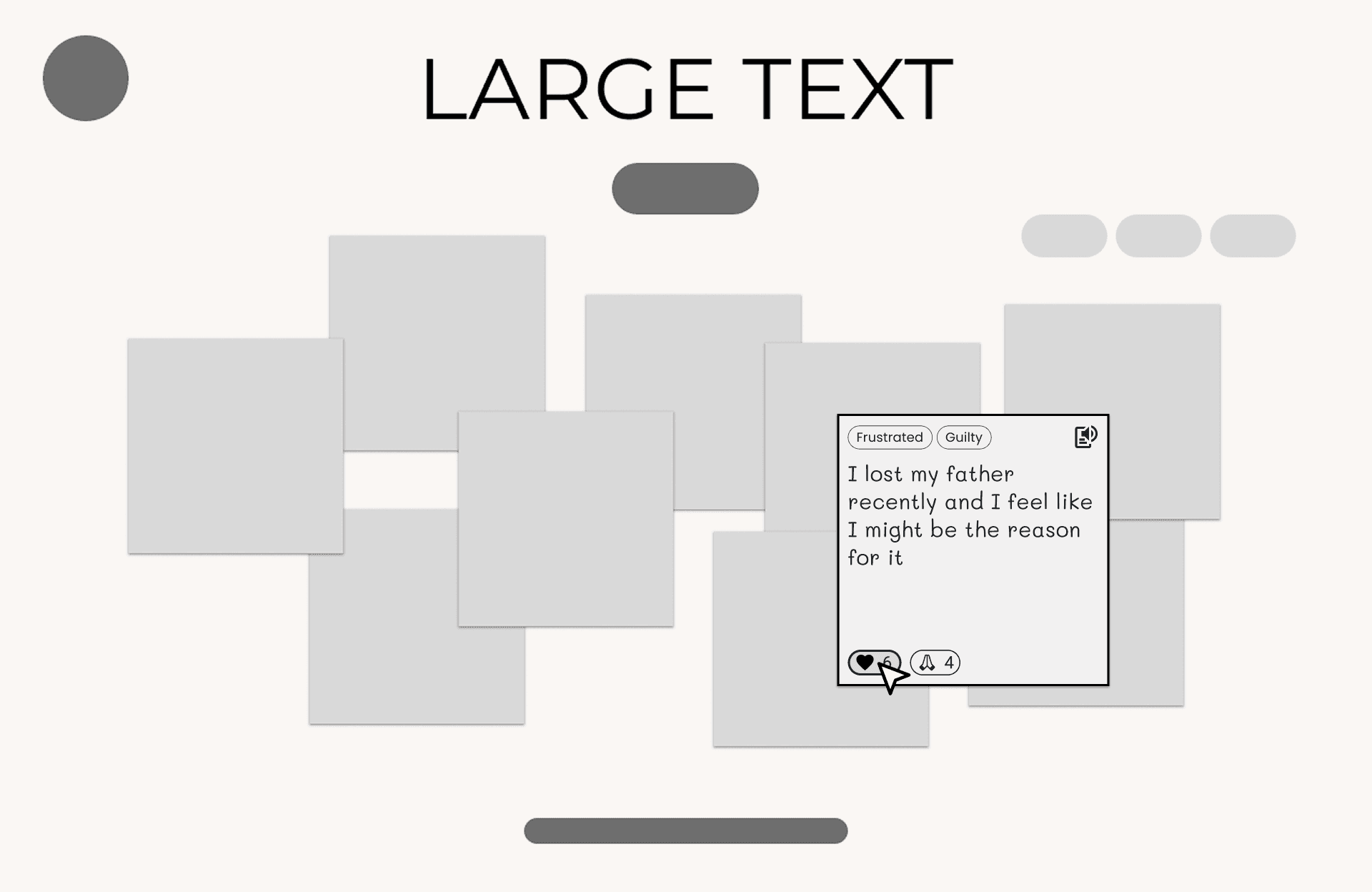
We were asked to allow users to tag their messages with these moods, but they were complicated since users would have to identify a pair of emotions instead of one.
Because our client’s research determined all emotions to be valid, we decided to split the emotions individually for readability.

Organizing moods by size
Now that moods are simplified, we have also increased the amount. So I focused on ordering each mood by size instead of alphabetical for visual balance and make reading easier.

Too many steps at once
There were 3 core features that we determined to be important when creating a note:
Mood
Color
Message
So I began putting all the main features on one form to see how it would look.

Guiding step-by-step
I broke each section into steps to help users feel less overwhelmed which created opportunities to add clarifying instructions along the way.
The following describes a linear story of our design and iterations, but the reality was much more complex.

USABILITY TESTING
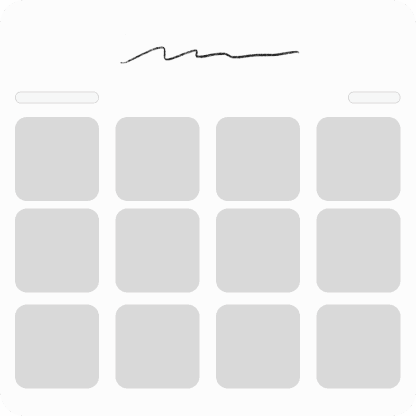
Ideations for homepage
We finalized on 3 distinct homepage concepts to conducted usability testing and user interviews to evaluate each idea, then shared our findings with the client to align on a direction, giving us time to refine and improve the chosen design in the final two weeks.
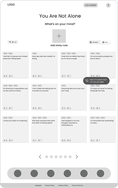
1
The Wall
2
The Canvas

3
The Map
1
The Wall
Referencing real world examples of post-it notes on a board with variations between a readable grid or scattered notes to evoke a more natural environment.
Readability

Natural

User experience test results
Although our usability results were successful, the experience could use additional improvements. Users felt the messages were inauthentic and overwhelmingly dense.
Users comfortably navigated the homepage.
Users comfortably created a message.
Created a sense of connection with others
Encouraged users to seek help
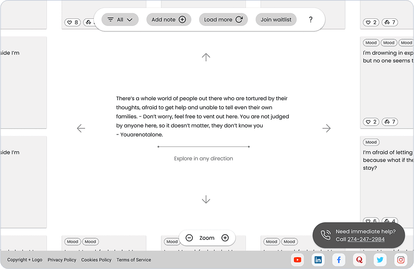
2
The Canvas
This design was a departure from the standard vertical scroll and an attempt to provide an experience where users can actively explore other people’s messages.

User experience test results
Users expressed novelty with the canvas, but began feeling overwhelmed once they navigated away from the center, feeling overwhelmed and lost among the messages.
Users comfortably navigated the homepage.
Users comfortably created a message.
Created a sense of connection with others
Encouraged users to seek help
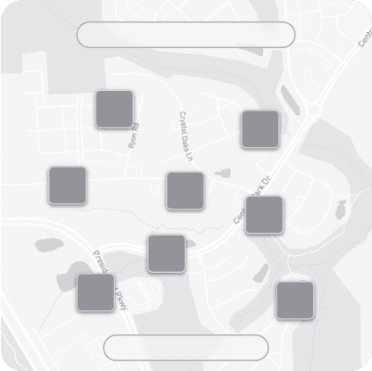
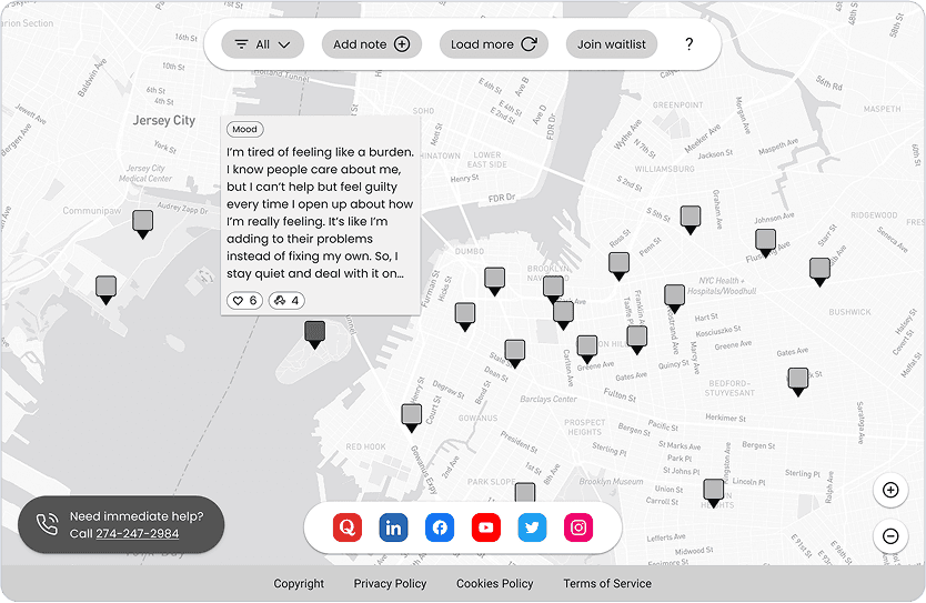
3
The Map
Explored an idea that attempts to address users' needs to feel connected with others by using a map to convey authenticity and that people are around you.

Usability test results
Most of our users preferred this idea since the map helped provide a sense of realism and the ability to see that there are actually other people around them sharing their feelings too.
Users comfortably navigated the homepage.
Users comfortably created a message.
Created a sense of connection with others
Encouraged users to seek help
Landing page winner
The Wall
The Canvas
The Map
The Map was the best user experience, but because of development limitations and deadlines, the team felt more comfortable designing The Wall.
Week 3 - Transitioning to high-fidelity
HIGH-FIDELITY
Continued improvements to user experience
Although The Wall wasn't our best choice, we could still improve the user experience from our user feedback. Committing to a decision and then executing it well was important.
Further iterations to the experience.

Vicarious trauma concerns
I identified a possibility for users to feel overwhelmed from the echo chamber of negative emotions so I suggested to add pockets of positive messages when hovering over each illustration.
However, due to time constraints, we had to remove the illustrations. Despite that, we still continue to improve the user experience wherever possible.

Improving message visuals
Gradient colors for gentleness
Added date for authenticity
One emote to avoid confusion
Hid tags to direct focus on message
Updating overall look and feel
Designed a floating action bar to keep the focus of the interactions at the center and persistent.
Softer colors allowed us to decrease white space to increase density and evoke togetherness without clutter.
Week 4: File clean up and final design
Endorsement

Praveen Kumar
Founder
Color palette
Customer engagement
Brand style guide
User experience
Typography
Graphic design
Brand identity
Web design
Mental health
Dennis is a very smart and hardworking individual. He is creative and able foresee the user challenges and suggest appropriate changes with valid data points. He is very talented and goes through the entire design process to get an excellent outcome. He is proactive and gives insights from user perspective. I enjoyed working with him and overall happy with the outcome.
Reflection
Understanding the right audience.
Looking back, I realized I should have been more intentional about aligning user research with the right audience. Most of the users I interviewed were based in the U.S., but my client’s platform was meant for people in India. Because of that, I may have missed important cultural perspectives that could have shaped the design. In the future, I’ll make sure to seek out participants who better represent the intended users to gather more meaningful insights.