Culinary
Companion
Helping users save time finding recipes with AI tailored to their preferences and health needs.


Project Type:
Personal project, end-to-end
Skills:
UX research, product design
Duration:
5 weeks
Even with available ingredients, figuring out what to cook can feel discouraging and overwhelming.

How might we help users quickly find recipes that meet their preferences while utilizing their available ingredients?
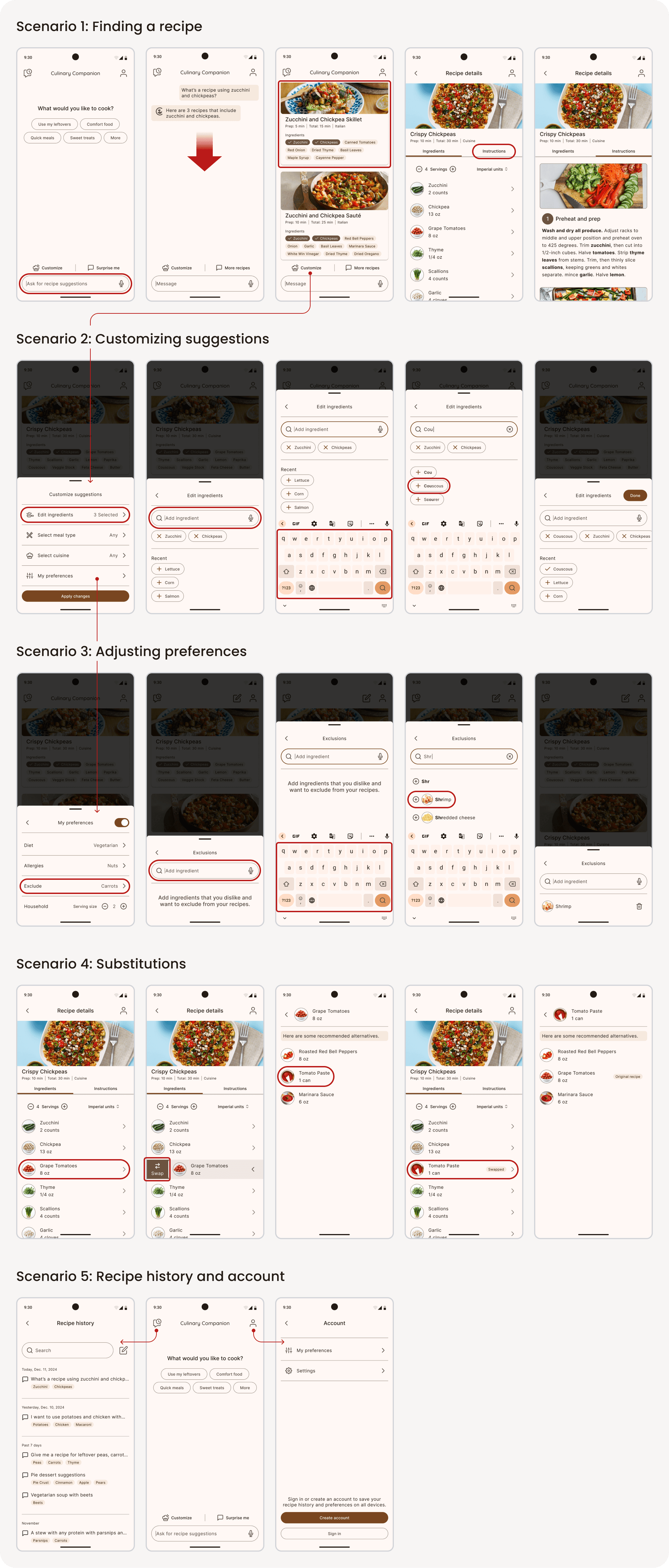
The Solution

The design journey that led here.

Understanding our users
Interviewed 7 home cooks to identify the steps they take to find a recipe and pain points.


Tap to view their interview
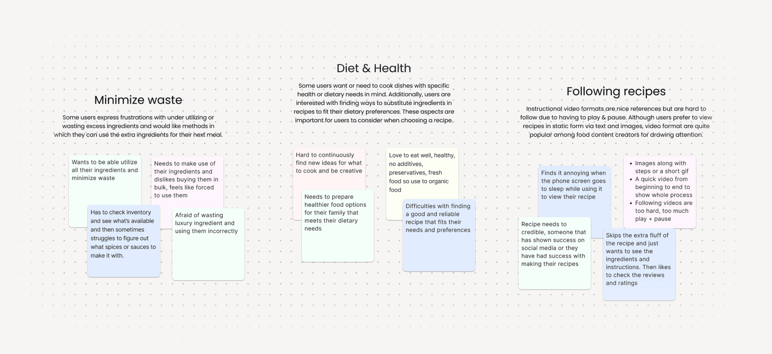
Identified pain points
Guilt of unused ingredients filling up.
Finding recipes matching their needs.
Instructions are confusing to follow.
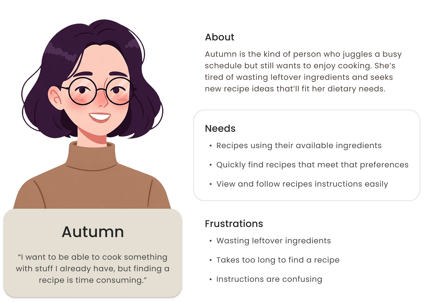
Focusing on our audience
Setting the foundations

Crafting the Identity
Joy
•
Creativity
•
Independence
Cooking assistant combined with alliterations inspired the name of the app. Earthy and neutral tones help elevate the colors of dishes.

#794620
#794620
#52443C
#FFF8F5


Harmonizing

Your cooking

Your recipes
Prototyping and testing
There were multiple iterations moving forward and back throughout the process, so here are some of the issues identified from usability tests and their iterations.
Design Iterations
Issue 01 - Generative AI Recipes Screen


Issue 02 - Substituting Ingredients
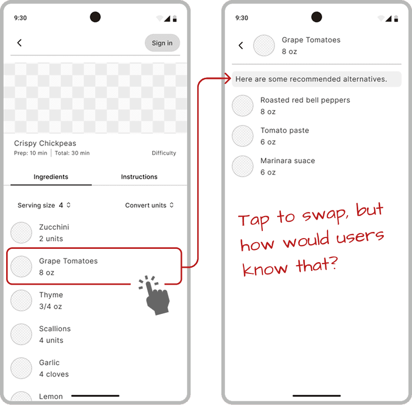
Problem:
How can we help users know that they can swap ingredients? [Skip to solution]
Design goals:
Clear affordance
Predictable outcome
Minimalistic aesthetic
Toggle button?
Toggle highlights swappable ingredients.
Problems:
Text unnoticeable
Too many taps
Have to scroll
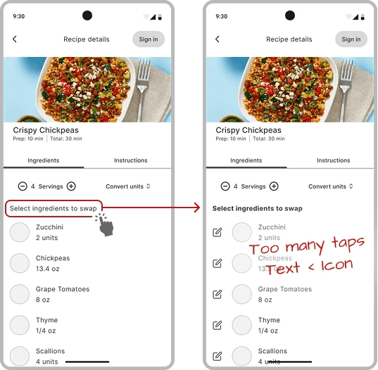
Idea
Making the ingredient elements intuitively interactable is ideal


Swipe action?
Usability test results
100% participants enjoyed the interaction
50% recognized the visual cue
—> Users would tap button instead
Design goals:
Clear affordance
Predictable outcome
Minimalistic aesthetic
Idea
Keep swiping animation but match user expectations.

Final design
Reflection
It was interesting to tackle issues incorporating AI as a feature. On the surface, it felt like it could be a "do-all" solution, but for the user experience, balancing users' agency and AI proved to be a challenge. For example, deciding between user prompted inputs vs. a physical button.


Improve accessibility throughout
The body text for the recipe instructions are 18px with extra spacing in between lines to improve readability and skimming while users are busy cooking. However, this attention towards accessibility could be further improved throughout the design. For example, the text size within the badges and recipe info are minimally 12px in order to fit nicely, but I believe that future projects should strive for better accessibility.

Non-leading tasks during usability test
When testing the usability for swiping the ingredients, I had tasks asking participants to interact with the it. However, I realized that in doing so, I am telling them that the element is interactable before they’re able to make their own observations.
So to improve upon this, I asked participants to express their thoughts and expectations before giving any tasks. This provided more accurate results on user expectations and the intuitiveness of the interactable elements.
Disclaimers
This personal project focuses mainly on creating an experience with various assumption and doesn't address the concerns and constraints that could occur with development.
AI-generated photos may not reflect the actual dish.
There could inaccurate portrayals of the dish, making the recipe look more appealing than in reality, thus may lead to perceived failure, disappointment and discourage users from cooking. In today's era of social media, it is more common to see the glorified side of cooking, which can be visually appealing, but can also be harmful to aspiring home cooks.
Health concerns with AI-generated recipes.
Although there is a feature in place for users to set their preferences and allergens, there would need to be extensive research and training to ensure generated recipes can be replicated in a kitchen safely. Generated recipes can pose health risks due to inaccurate nutritional information, overlooked allergens, and unsafe ingredient combinations.


